Escape in to beauty

Saturday, August 20, 2011

Sephora Dare to Play Look

Alrighty, I plan on going in to a little bit more detail with this blog post.
This is the look I decided to recreate. I was shopping on the Sephora website when I saw this ad:
(ALL links are clickable for a bigger view)

And I thought: I can do this, this is easy.
So..I decided to make a tutorial on it.


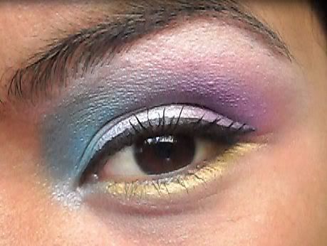
This is the final eye look. As far as the face goes, its pretty standard. I'll list that at the end of this blog.
There are a few things that I did a little differently:
1.) Instead of using a teal green, I used a mixture of blues and sky blues.
2.) The inner eye light is not a blue, I used the same silver that I used on the center of my eye in the inner corner.
3.) I did not use fake eyelashes, all though, if I were going out I would throw on some fake eyelashes. They pull the final look together. 

I do feel like the blue makes this a more wearable look. Its bright, fun and very feminine. For some, this might be a little bright and in your face. These are definitely not fall/winter colors BUT they're such FUN, BRIGHT colors! A night on the town, parties, new years eve...this such a fun look I couldn't pass it up. I was...inspired I guess, lol.


To get started:
You want to prime and base your lids. Well...at least prime them. When I finally took the purple off, I found that even with a primer and a base it still stained my eye lids (for a while). 

I'm using Too Faced Shadow Insurance but I think using the Urban Decay Primer Potion in Sin would give this look even more of a pop with its shimmery base. I'm using a white base so that these colors really pop. I want them to be vibrant and really show up.


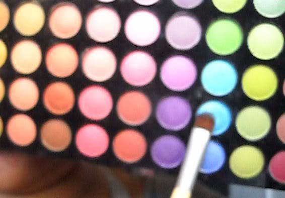
To get started I'm using this blue on the inner corner and I'm going to blend it up into the crease. Using a paddle brush, I'm going to pack the color onto the inner third of the lid. You're going to want to take the blue crease half way over the eye lids, like in the picture above.


Then, using a fluffy Sonia Kashuk brush I'm going to take this pink-lilac color and blend this into the outter half of the crease. This will help transition that purple out (basically help to blend out the purple color I'm going to use to add more definition to the eye).


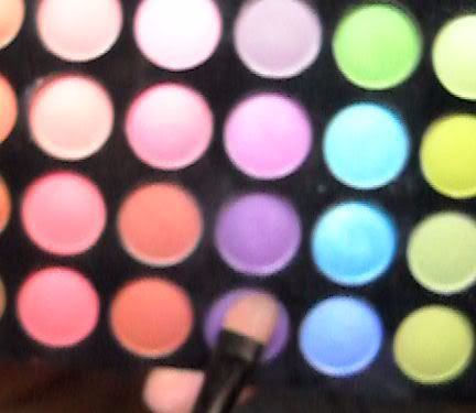
And I'm going to be using this deep purple and mixing it with the one above it, I'm going to create an outter V and blend it into the base of your brow, but not past the pink-lilac color.

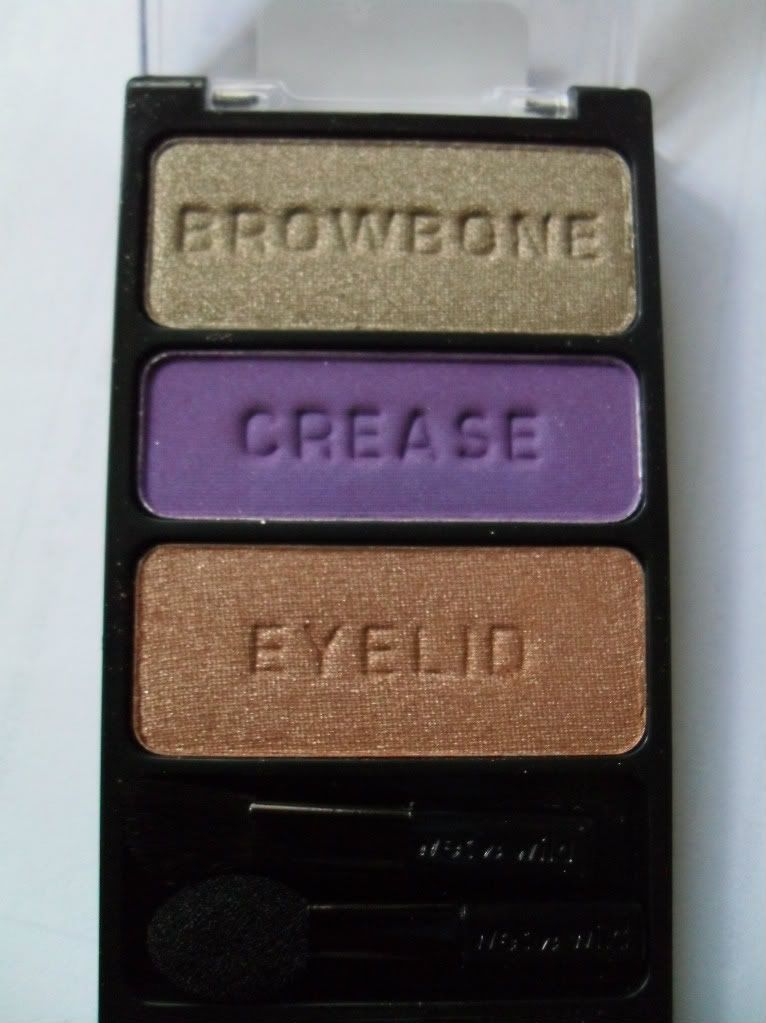
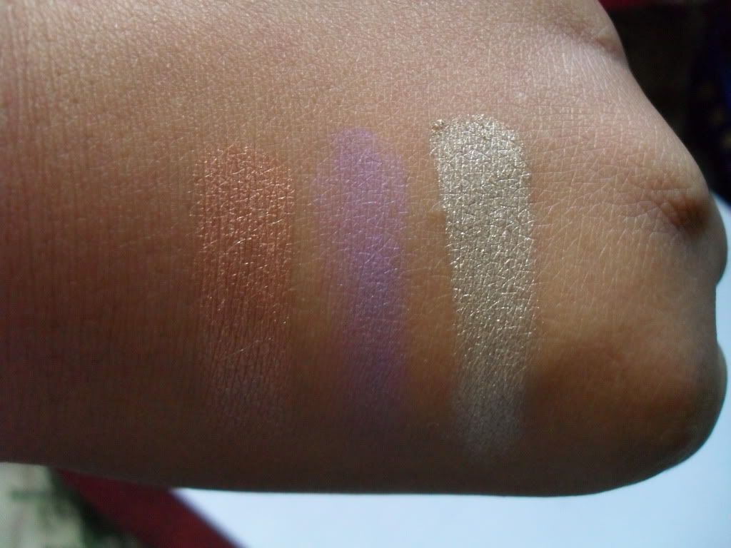
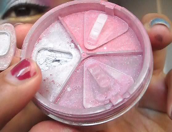
For the center of the lid I used this Prestiege Cosmetic Mineral Trio. I'm using the silver from this trio and I'm packing it onto the ceneter of my eye lid and blending them in to the purple and blue.


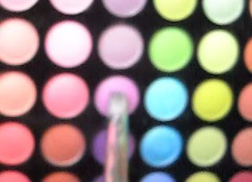
The brow bone highlight is very dramatic and bright. For this I'm going to be using a mixture of these two top left colors below:

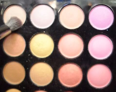
Using a fluffy brush I'm going to blend the two colors together and use it as a highlight. Not only is this very bright and dramatic, but it matches the picture perfectly.

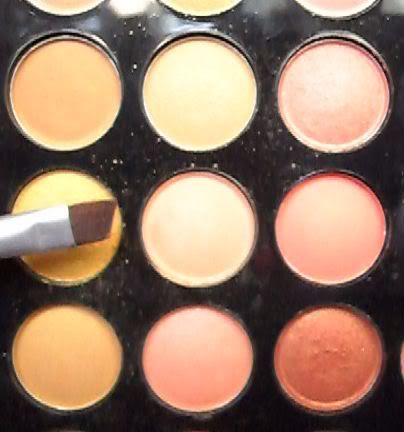
Under the eye I'm using a golden yellow color on an angled eye liner brush. I worked it right in to the eyelashes and across the entire bottom of the eye.


This basically completes the eye look. You want to line the top of your eye with any type of eye liner, tight line and line the water line with a black. Finish off with a mascara and you are complete. 

To finish the face off you will be using any type of matifying foundation.
Use a light pink blush on your cheeks and a bright pink-fuschia lipstick (perferably with a cream or matte finish) and the look is complete!

Viola, enjoy!

Labels: , ,

Wednesday, August 10, 2011

Elizabeth Arden Provacative Interlude

Ah, sweet musky, citrusy scents.
I've really been enjoying them this summer. And this one by Elizabeth Arden is no exception.


First of all, may I say that this packaging is exquisite. I've been on a purple kick lately so naturally the packaging lured me in. The lace working on the box and the bottle are beautiful. The packaging of the lotion is not impressive at all. It's quite plain.

The box is a light lilac color with a deep purple lacing. I plan on keeping the box, and just removing the velevet insert that holds the perfume and lotion in place. 
The bottle itself has an impressive lace overlay on the bottle. The lotion is clear, and its odd shape makes it quite unusual. I actually quite like it.
The lotion bottle is just a standard tube lotion bottle. It's light lilac, not impressive.


The smell itself is a deep musky fruity scent. Because its an Eau de Parfume, it has a very strong scent that will last you a few hours, four to five at the most. Smelling this I get a nice blend of mango's and musk and a little hint of a woodsy scent. Its beautiful if you like citrus musk.

The cost of this product is $58. It released in 2006 so the price has dropped quite a bit. 
I hope you guys enjoy this scent as much as I do. It's available at Sephora, online, and at Elizabeth Arden's website.


Labels: , ,

Sunday, August 7, 2011

Wet n Wild Dream Weavers Collection

I FINALLY FOUND THEM!! YEEEE!!
Anyways...LOL
Like most of you, you probably have seen Emilynoel83 video on the Dream Weaver Collection from Wet N Wild. I had no idea that they were releasing a new limited edition palettes until I saw her video and I went hog wild! I love the vibrant colors and selections. So, I decided to go on a scavenger hunt to find them. And boy oh boy did I go on an adventure.

I literally scaled the greater Sacramento area trying to find these trios. A long story very short, after searching all of Sacramento and the surrounding areas I finally found them in one of the Rite Aids right here in my own little town. 

But I'm glad I did go on that adventure because now I can fill you guys in on some tips if you're still searching. I'll add those at the end of this post. For now, lets get on to swatches and reviews.


Left to right:
Bright Idea
Earth Looks Small From Down Here
We're Blasting Off
Dancing in the Clouds


These are the four palettes that really stood out to me. I know there only $2.99 but I just didn't find it realistic to buy the other two palettes. I don't wear blues and reds, and as far as blacks/silvers/whites go...WnW doesn't make great ones. I have no problem buying a Mac Collection, but I really did not want the other two palettes. There not colors I was impressed with.


Bright Idea Palette

These colors are slightly reminiscent of rasta colors. 

As far as payoff goes, All swatches were done without a base or primer, so what you see is true pigmentation. I love that you can see the shimmer and sheen that comes off from these palettes. That's one thing that I find consistant throughout these palettes. They all have a nice shimmer to them.

Now, the yellow is very vibrant. The green and pink color is quite sheer and needs to be build up. But, seeing how the pink is meant to be a highlight color, I do believe that the pink is supposed to be sheer.


Earth Looks Small From Down Here


I absolutely love these colors. Now, I skipped out on picking up the green palette that released in January because I'm not to fond of greens. But this palette is beautiful. The brow bone color is a copper green while the crease is a dark royal blue and eyelid color is a nice teal, ALL with shimmer.

Great pigmentation and overall great pay off.


We're Blasting Off


This trio is fabulous! Just like Emily said it really does remind me of the Silent Treatment palette that released in January, which has worked its way in to my every day makeup routine. I love that palette, so naturally when I saw this one, my jaw dropped.
The brow bone shade is a very sheer, almost matte, pink. The crease color is black with tons of red shimmr (definetely found in other WnW palettes) and the lid shade is a light taupe color. 

Now, comparing the two palettes (Silent Treatment and We're Blasting Off) they are very similar but not quite the same color. My next blog post will be some comparison swatches to other WnW palettes.


Dancing in the Clouds


This one is definetely one of my favorites. The brow bone color is, in my opinion, a beautiful silvery taupe while the crease color is a sheer purple and the lid color is a rosey gold color. 

As far as pigmentation and pay off, the top and bottom colors are exquisite while the purple color is definetely a miss. Its very sheer and hardly shows up. On lighter skin tones you might have better luck, but for woman who are tan like I am or darker....good luck trying to make this work.


Overall, these are great palettes and it's so refreshing to see Wet N Wild switch up there marketing, packaging, and outsourcing. I've been on the Wet N Wild bandwagon since I started with makeup. In fact, the first makeup item I purchased was from this company. These palettes are exquisite and very playful which I like to see. I appreciate the color schemes and if you can get your hands on them, definitely do! The brushes are completely unrealistic, well, except, of course, for the sponge tip applicator. The blending brush they give is truly a joke.


BUT-keep these tips in mind if you are still searching for them. I went on a mad hunt for these yesterday, so I learned a few things.

1.) Check your local RiteAid FIRST.
I went to about 16 different stores ranging from Walmart to CVS to RiteAid, etc. The CVS didn't even carry the display (I've worked inventory Retail, they checked the system for the SKU #, they didn't have any) and Walmart didn't have them either. So, RiteAid and Walgreens will be your best bet...but every RiteAid I went into had the display up (I went to 7).

2.) Check the Wet N Wild are, DON'T JUST LOOK FOR THE DISPLAY
I went into a Rite Aid that did not have the display up, but after glancing over the display I spotted the red/black/silver palette, blue/black/white palette, and the Earth Looks Small from Down Here palette in the actual Wet N Wild area, just hastily tossed in the spot were the trios are placed. Either bad employee merchandising, or customers who were too lazy to put them back. Either way, check there before you get discouraged. Thats how I picked up the 'Earth..." palette.

3.) If you've found previous "New Released" items in a certain store when they were suppose to release, CHECK THERE FIRST!
There are 2 RiteAids, 1 Walgreens, and 2 CVS stores in my town. Any time Wet N Wild releases a new product, I've only been able to find them in ONE of the RiteAids in my town, but its on the other side of town so I hardly venture out there. So, imagine how idiotic I felt when,  after driving all over creation, I decided to check that RiteAid, and sitting in the same spot that I found the collection that released in January, were these puppies. So please, check and check and check.

I think certain collections release to only CVS/Walgreens and certain collections only release to RiteAid. I'm not too sure, but if someone is, let me know! Thanks!

I hope you guys find this helpful.

I'm planning on doing tutorials for these palettes!

Labels: , , ,

Friday, August 5, 2011

NYC Blushable Creme Stick Review

Ah, lovely cream blushes. I have to say that I've been loving cream blushes lately. I love using cream blushes under powder, it gives this really natural flushed look.

TIP FOR THE DAY: 
The next time you decide to wear powdered foundation, apply primer first, than add a nice cream blush to the skin. You want to add more than you are used to because you will be applying your powdered foundation over the blush. It will give your skin the most natural looking "blushed" look. It works with almost any color. I've used purple and lilac colors in this fashion and it looks beautiful, and quite natural.

These blushes I originally seen on Divamakeupqueen channel and then again on Emilynoel83 channel.
I decided to try these out for myself, and I have to say...DON'T WASTE YOUR TIME.

I picked up 4 colors:

From left to right:
-Plaza Pink (Light Coral)
-Big Apple Blush (Rosey Pink)
-Berry New Yorker (Classic Nude Brown)
-Mauvin' Uptown (Bronze shade)

They look beautiful right? Well, too bad they don't stay that color. They blend out to be very sheer. You can barely see the color! As a base, they are ok...I've seen better. You can make these work, you just need to blend out the color, than pack on more blush in the center so that you get some pigmentation. 
You can barely see the color, and all I did was blend them out in the spot they were at. 
The formula is very oily, and I'm not a big fan of that either. I find that with my oily skin, it makes me look five times more oily in the area I place this blush. Even if I set it in place. You have to constantly blot your cheeks, unless you like to have an oily face....I guess. 


These blushes range between $2.99-$4.99 depending on where you  go, so you really can't expect much. I think I'll stick with my Mac Cream Blushes for now, sorry NYC!


-

Thursday, August 4, 2011

Drug Store Summer Nail Polish Faves

This is a long over due post, especially since Summer is almost over, but I want to get this post up before Summer is officially over. So, with no further wait, lets get started. I'm going to appologize for the swatches, I did them quite hastily so they're not at the best quality.
Obviously you all already know what this post is going to be on-So I'll keep this intro short.


All of the nail polishes featured here today were all purchased by me, from the drug store, and range between $0.99 - $3.49 SUPER CHEAP. So give them a try. Its not going to break the bank, and if you don't particularly like the colors, no biggie! It was only a couple of dollars (LITERALLY! Lol)


As you can tell, its quite a wide range of color. I decided to do drug store instead of high end because most of the high end polishes I've been reaching for this Summer were from limited edition sets that are no longer available. Plus, These polishes were left out for most of the summer because I found that I kept switching out one of these nail colors for a different one, quite constantly.

Lets start with the three on the far left.
Out of the bunch, I would consider these to be standard kind of neutral colors.


Elf Nail Polish in Minted ($1.00) 
Found at Target, Dollar Tree (<--your general dollar store) or Eyeslipsface.com
This polish goes on as a pastel mint green. I'm not really a huge fan of most of the Elf nail polishes because I find that they stain your nails if you don't use a base. This polish DID NOT stain, which I was quite impressed by. I won't lie, you do have to work with this formula a little more than normal because if you apply this wrong, it can go on very streaky. But if you follow my blog, you know that I like to let nail polishes dry completely before applying a second coat, which, for this polish, helps to diminish streaky-ness.

Sally Hansen Hard as Nails Xtreme Wear Nail Color in 360 Mellow Yellow ($2.99)
This brand, as specifically, THIS LINE of nail polish are in my top 3 drug store nail polishes. The cream colors tend to be very opaque and with some colors, I can get away with wearing just ONE coat! This color is a very vibrant yellow, so don't let the bottle fool you. I brought this thinking it would be a nice pastel yellow, and I was wrong. Its almost a banana yellow, but more refined...if that makes sense? LOL. You will see in the swatches at the end of this post.

Wet n Wild Megalast Nail Color in 204A Private Viewing ($2.99)
Wet n Wild has come such a long way from when I started using them, and Wet n Wild is actually the company I started out using make up with! I've always been a HUGE fan of there makeup, especially since their makeup is what I first started using.
NOW--is this nail polish worth $2.99? No. As far as the Megalast Nail Color Polishes go, you don't really get a lot of product as say, the Sally Hansen ones, and they formula is quite watery. But I love this color! I originally got it to see if I would jump on the "Nude Polish" band wagon, and at first I hated this! But after deciding to give this a second go, I actually fell quite in love! Its a nude brown with pink undertones, which I actually like because in certain lighting, it looks like a gorgeous baby pink color. You do need to build this up, Normally I use about 4-5 coats before I'm satisfied with how opaque it is, but as far as nude polish go, thats apparently normal.


Moving on to the REDS/PINKS/andBERRIES
I really like this selection of colors here, especially since they are so affordable!
Lets get right into it. And remember, all pictures are clickable, and swatches will be at the end.
From here on out, I won't really be reviewing too many of these because they've been hyped up and out for a long time.

Jesse's Girl High Intensity Nail Color in JulieG ($2.99 @ Rite Aid)
Amazing corally pink color. I love this on my nails, and during the summer, it really pops against my tan skin.

Confetti Long Wearing Nail Color in 047 Last Dance ($.99-$1.99)
These nail laquers are actually not too bad. They do take a few coats to build up the right finish, but they are quite opaque. With one coat, I find that the color shows up beautifully, but give it a day and it will look like you  colored your nails with a marker. SO--I do love this color and I've been wearing it a lot during the summer. It's not originally, so IF you want to get something a little higher end, I would recommend it. But I don't mind working with this color because its such a beautiful reddish pink that can even transition to a fall color. LOVE IT.

Wet n Wild Fast Dry Nail Color in Everybody loves Redmond ($2.99)
Beautiful red. It suits my skin tone perfectly. Its a warm toned red, so people with pink undertones, BEWARE!

Another Elf- This one is called Hot Pink
Not really a hot pink, more of a Strawberry pink. You will see in the swatches. 
Just a fun color, I've gotten compliments on it a lot this summer. This one didn't stain either, but if you have weird nails, use a base just to be sure.


Now on to my favorites: PURPLES!
From left to right: (This is just a good pic of them all)
Wet N Wild Megalast Nail Color in Through the Grape Vine
Sally Hansen Hard as Nail Xtreme Wear Nail Color in 190 Polish Plum
Sally Hansen Hard as Nail Xtreme Wear Nail Color in 270 Lacey Lilac


I've sincerely been on a purple kick. These three have been the ones I've reached for the most threw out this summer. I don't know why, but lately my life has been incomplete with out purple in it.


As far as these two are concerned, they are my all time favorite drug store nail polishes at the moment. The lilac purple is just a nice pastel purple (which I've had a hard time finding) but against tan skin, it just has this nice pop of color that I've really been enjoying.

Posh Plum (On the left) is this really vibrant highly opaque shimmery hot purple. Out of all of the nail polishes featured today, this is the one I'd recommend you ALL get. For a shimmer it so opaque and vibrant and bright. It doesn't even need a top coat, though I recommend it for the staying power.

The last one is just a nice creamy purple. Its very simple but very chique at the same time. Purple compliments my skin tone, and this purple is quite neutral as far as undertones go. I like it and the formula isn't so bad on this guy.

NOW ON TO SWATCHES:
I did these all at once in a hurry, sorry!


This is Through the Grape Vine on my ring finger, and Last Dance on the rest.
2 Coats

Sally Hansen Lacey Lilac (L) Posh Plum (R)

Elf Hot Pink (L) and Sally Hansen Mellow Yellow (R)

Wet n Wild Private Viewing (L) and Elf Minted (R)

Wet N Wild Everybody loves Redmond (L) and JulieG
*This particular photo I did last minute, I wasn't going to take it because there 
are soo many swatches and reviews out there
I did it in a hurry, it's not this streaky and clumpy in real life.


I hope you guys enjoy! Since Summer School is officially over for me I plan on plowing through a bunch more of videos and blogs. Check me out on YouTube by clicking here.
Thanks and I hope you guys are having a fabulous summer!

Labels: , , ,