Escape in to beauty

Friday, March 16, 2012

Cheap Accessories

Three this week! Amazing! Lol

I'm trying to steer away from technology and get back to my natural roots. I feel like kids today rely too much on the convenience of technology that if something happened that wiped it out, they would be useless. I read a study somewhere that said that kids now days no longer and taught how to read a clock. I hope that's not true...

Anyways, I wanted to share with you guys this cute watch that I picked up on sale through Amazon. 
Very inexpensive, maybe $9-$10 with free two day shipping. I also spotted a girl who had the same one and she said she got hers at Staples for the same price. 

Anyways, the band is made out of gel. I really like that because I normally wear this watch to school and I HATE the clunking noise that metal or plastic watches make. The rhine stones add a touch of chic-ness that I really like and the white just ties the entire thing together.

This watch comes in practically all colors under the sun, (At least on Amazon).  

It can be quite large if you have smaller wrist. It's very light, and it seems very sturdy. I've had this watch for a little over a month now and I have not had one single problem with it.

If you are worried about the ban being too short, don't be. I have LARGE wrist and when I first read the reviews, I was skeptical if the band would even fit around my wrist! It does! 

Here's the link if you guys are interested, enjoy!

Labels: , , , , ,

Wednesday, March 14, 2012

Rimmel Match Perfect Foundation-Product RAVE.

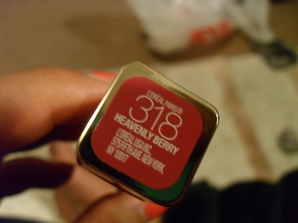
Its another early morning of no sleep on a busy day. So, since I have a few minutes to spare, I've decided to put up a blog. This time, its on this little gem that I found in my local CVS store.
I try to pick up various shades when I buy foundation because I can tan relatively easy and its difficult for me to just have one "summer" shade. Usually in the summer months, I can go from being as light as an NC35 (in extreme cases, usually I go as light as an NC40) to as dark as an NW45. Sometimes I can go from an NC40 to an NW 45 from just one day at the beach! Bless my skin for being resilient to sun burn, but it can be VERY frustrating when you are an avid make up junkie.

This particular foundation ranges from $4.99-$6.99 at the drug store. Very inexpensive, but for my taste, it is money well worth spending. If you are someone who likes full coverage, or even a medium coverage, I don't mean to waste your time. This is not the foundation for you and I will not be insulted if you click off this page. But for people who like a sheer to light coverage that is buildable to a medium coverage, this might be something worth trying.

I am absolutely in love with the concealer that comes from this line. Usually I tend to shy away from Rimmel foundations because they are so cheap. For me, cheap usually means MEH. But I decided that, since I love and rave about the concealer from this particular line, I might as well try the foundation as well. 

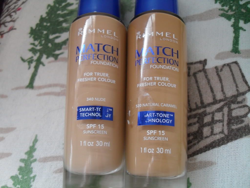
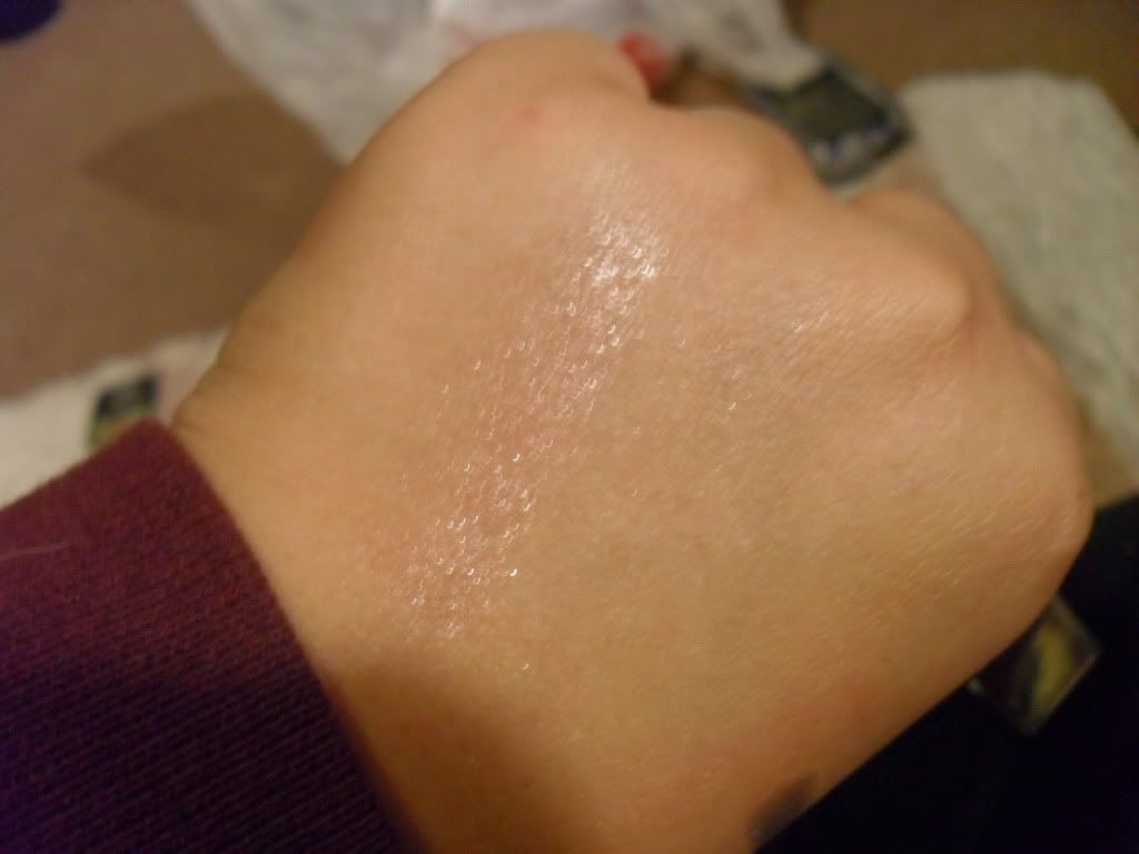
Here are some swatches of the two that I've picked up.
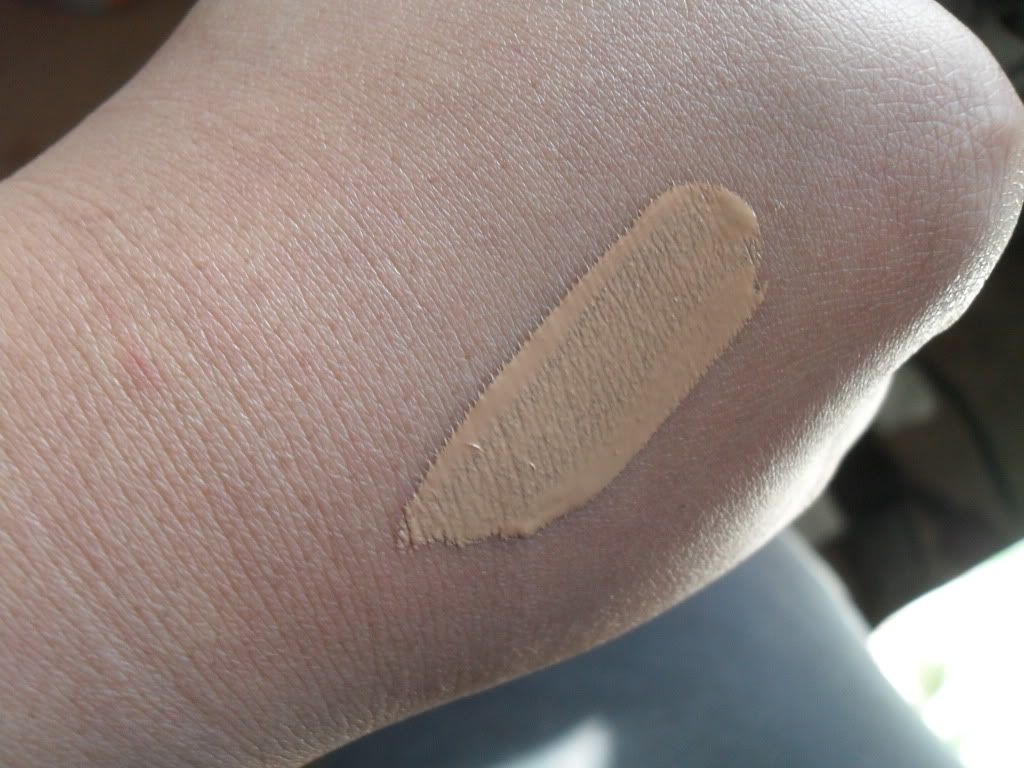
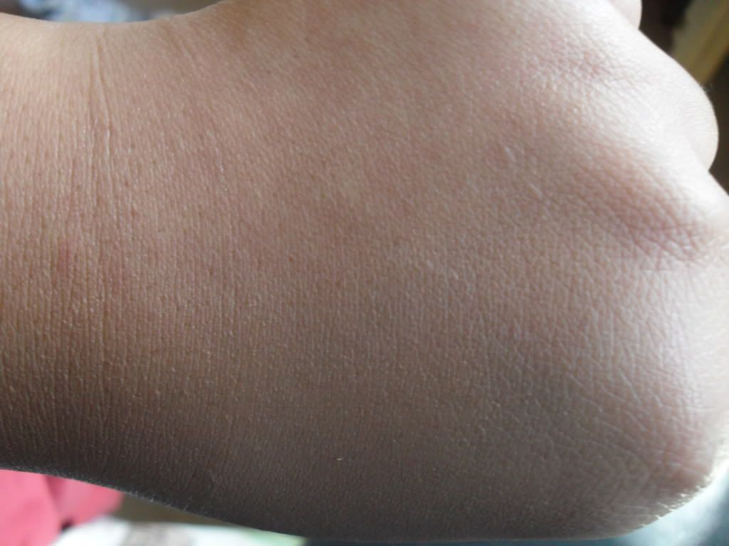
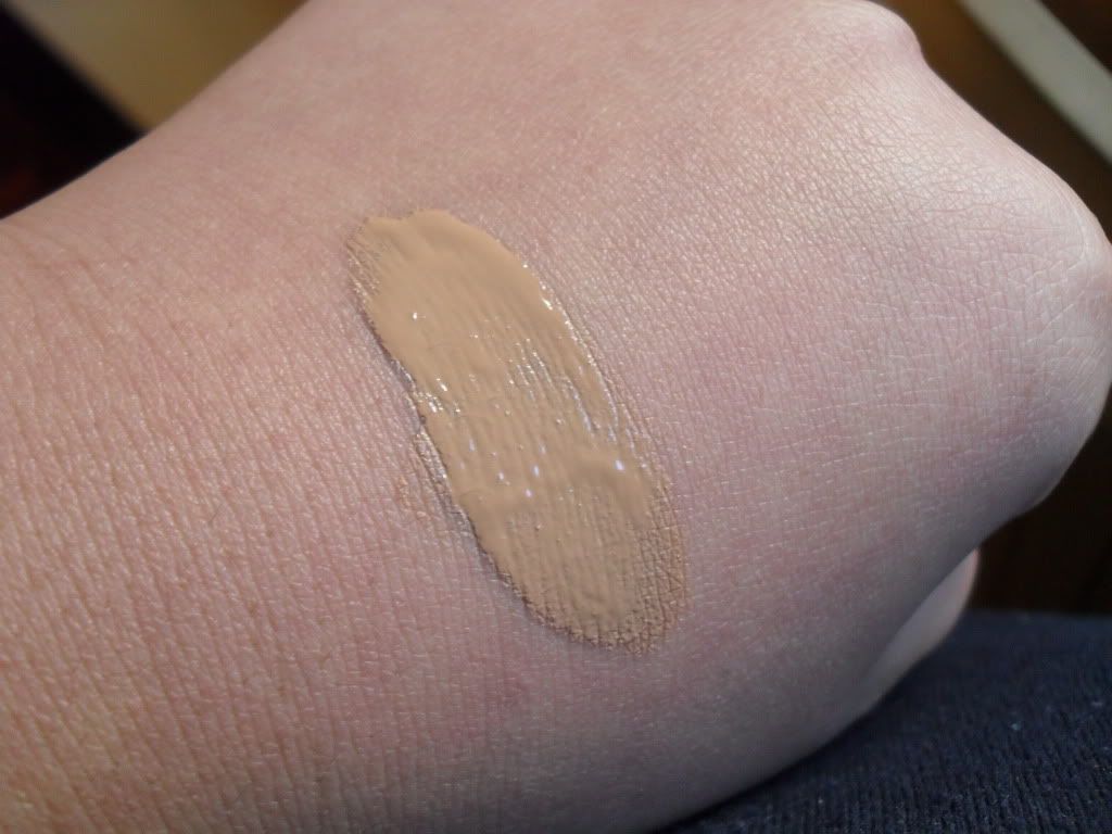
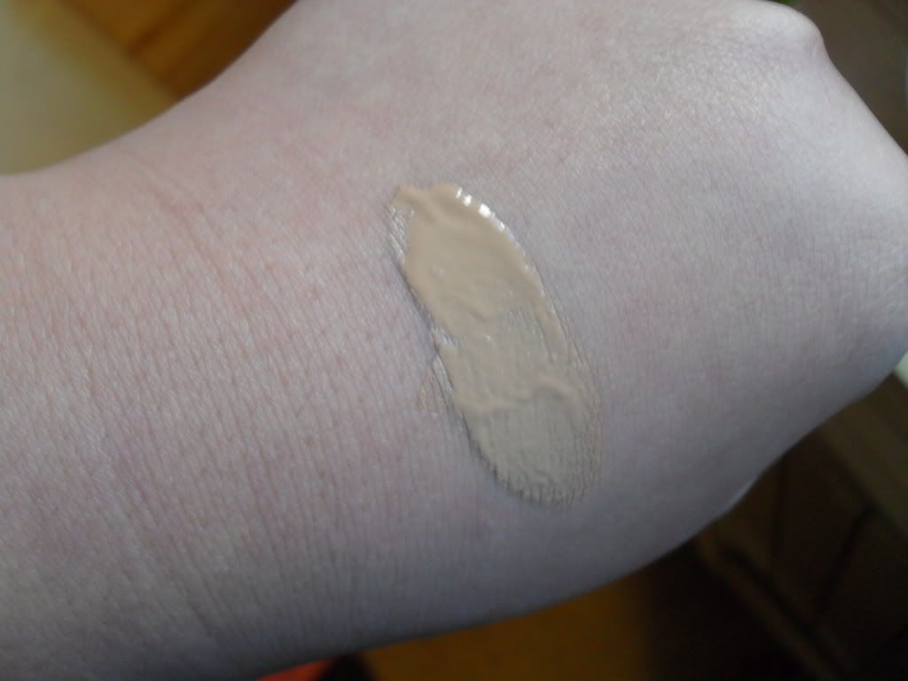
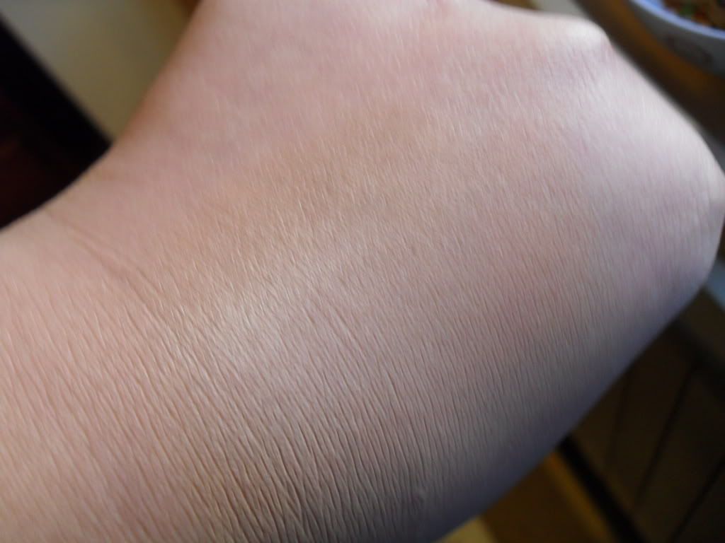
340 Nude
(Top photo: swatched; Bottom photo: Blended out)
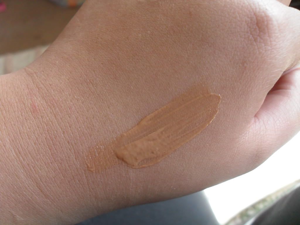
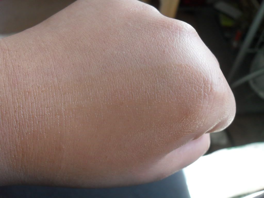
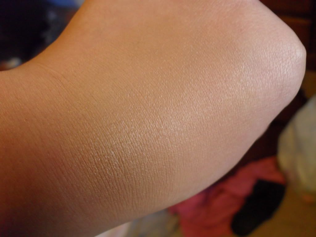
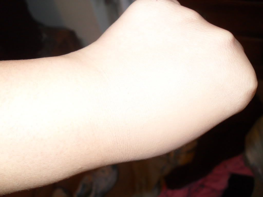
520 Natural Caramel
(Top Photo: Swatched; Bottom photo: Blended Out)

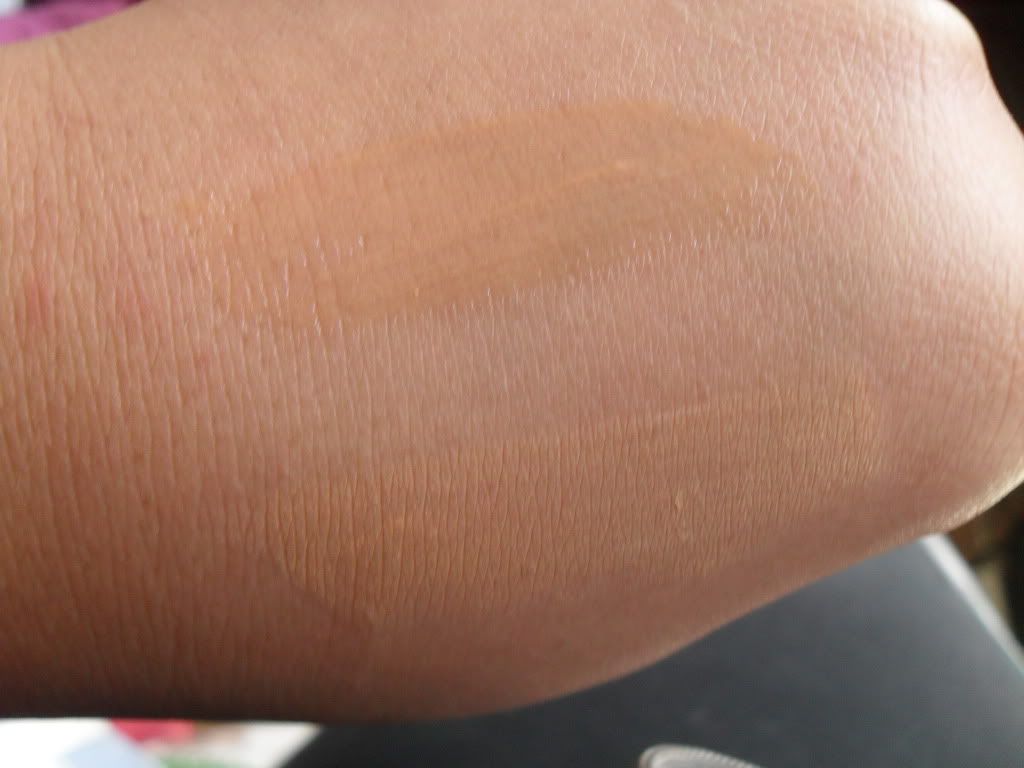
This is what the two look like side by side:

As you can clearly see from the picture above, these foundations are very sheer and can look very streaky. So you must be wondering why I call this product a gem?
Answer: It blends out AMAZINGLY.

I use a standard buffing brush; my preferable brush of choice is the powder brush from E.L.F. It's basically a synthetic flat top kabuki on a stick. Dab some on to your face and buffing it into your skin creates a very evened out, flawless complexion that looks like natural skin. And trust me, I am a NAZI when it comes to foundations looking natural. I'm okay with having flamboyant eye shadow, but I am NOT okay with having foundation that is noticeably, well, fake.

The coverage is very sheer at most. I would compare this to a highly pigmented tinted moisturizer (if that makes as much sense as I think it does). If you have fairly decent skin and you just want something to even out redness and a few minor blemishes, go ahead and give this a try. I find that this is even buildable up to a medium coverage if you absolutely need to, but I find that this is a more suitable alternative to a tinted moisturizer.

Now, that last statement must bring up a few questions..why would I need an alternative to a tinted moisturizer? Well, I have combination skin. The outsides of my face tends to be dry while the insides of my face can range from oily to normal. I find that most tinted moisturizers can be too much moisturizer for my skin and causes me to break out. I like the formulation for this foundation because its water, light, yet pigmented enough that I can blend it in without it being so sheer that it does nothing.

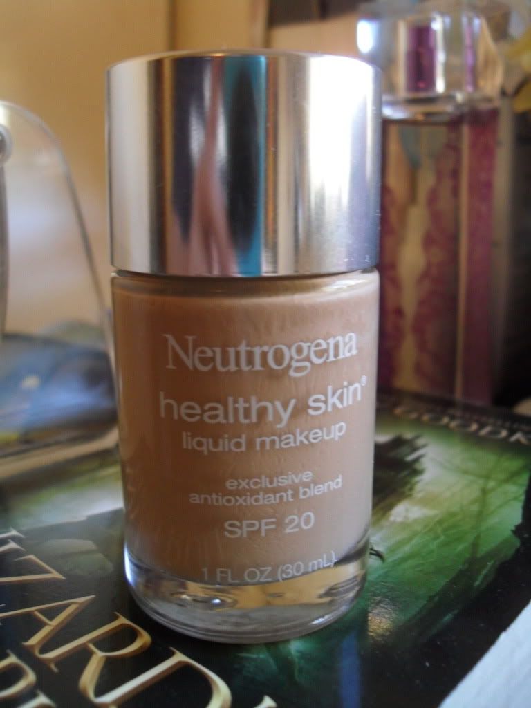
Now, like I warned you at the beginning, this is not something for people who are looking for a cheaper alternative to a medium coverage foundation. This is sheerer then Neutrogenas Healthy Skin and a little bit more watery than a tinted moisturizer. I hope some of you found this helpful!


Labels: , , , , ,

Monday, March 12, 2012

Neutrogena Healthy Skin Foundation

Daylight savings is such a pain to adjust to in the Spring! And today is not the day to get no sleep. Oh well, here's a quick review to start off (well..continue really) my 26 hour day :( I can't wait to get home tonight to take a quick nap before working again tonight. Oivey!


I've been trying out new foundations recently and I decided to go ahead and give this one a shot. There has been a lot of buzz about this particular foundation on Youtube for a few months so I decided to go ahead and try it out. The shade that I selected is 110 Honey Beige. It's the perfect skin color, however it is not yellow enough for my skin tone. #tangirlproblems? Can I get an amen..(AMEN!) I can easily fix that with a yellow corrector, so its not a big deal to me.

Swatches
(Bottom photo: In direct sunlight)
You can see from the photo that this particular foundation is warm toned. The yellow-ness to this foundation (for me anyways) is almost a neutral yellow, so it doesn't pull too yellow if you are someone who has a problem with foundations being too yellow for your warm tones. Sadly for me, I have the exact opposite problem. For some reasons, even higher end foundations are not yellow enough to suite the undertones in my skin. 
I have found, however, that this is the perfect foundation to neutralize your skin tone. 

Blended Out Swatches
(Top photo: Blended in Natural lighting; Middle photo: Artificial lighting; Bottom photo: Flash)

This foundation gives a light coverage to medium coverage, at most.  I do not see, in any way, how this would be considered a full coverage foundation. I prefer a lighter coverage then this, and I found this to be a medium coverage for my taste. If you are some one who likes complete full coverage, this is not the foundation for you.
I did find that this is very long wearing and blends in beautifully. I could feel it sitting on my skin, but it wasn't so heavy where it bothered me or even seemed to be a problem. Once this foundation sets, it doesn't really budge either. I had this particular foundation on for about 12 hours, having to blot once, and managed to make it work. It evens out your skin tone, but is still light enough where it feels great and you skin can breathe. 
As far as photos goes, I'd definitely give this foundation a pass. This is more of a foundation that should be worn on a day to day basis. It's very light, blends out to a natural finish, and is appropriate for day to day wear. However, the white cast when using flash is horrible. So if you are looking for a night foundation, or something to wear while going out, give this one a miss unless you are looking for a natural finish with minimal pictures taken.
 Price wise it runs between $12-$14 at most drugstores, however I suggest picking this up on sale. I managed to get my$9.00 including tax)

Overall I really like this foundation. I've been on a foundation kick lately and I have been trying a few out. If you've tried it, let me know what you think and how you apply it. I apply mines the standard way, I'll link my tutorial when its uploaded on youtube! 

Labels: , , , , , , , , , , ,

Tuesday, February 14, 2012

Loreal Colour Riche Lip Fails.

I absolutely love that their is a huge trend for tinted color lip balms. I absolutely adore tinted lip balms because they can look very natural yet they add a bit of color while keeping your lips hydrated and moisturized. They are my most favorite lip products. I'm not going to lie, I am a HUGE fan on the Revlon Lip Butters. I've picked up 12 of them and a few backups). SO when Loreal came out with their version I naturally wanted to try them. I watched the lovely hollyannaeree a few days before and she had mentioned that they were not that pigmented. I decided to try just one, (the darkest one since I am very tan and colors have a hard time showing up on me), and well...here's my review.


This is the one that I picked up. It is 318 Heavenly Berry and was the darkest one on display when I got there. Because I am quite tan, I like to go for deeper colors or extremely bright ones because they tend to be more pigmented and show up a little better on my lips. 

The packaging is gorgeous. It is a little bit bigger than a Revlon Lip Balm but I do think it is cute and sophisticated. I prefer these packaging to the traditional lip stick packaging. Very sleek and sophisticated in my opinion. (The inner tube looks just like the Revlon lip Butters, so I did not take a pic of that).
Here is the swatches, both on the hand and on the lips.

(^This picture is not very flattering, but you get the idea >__< lol)

Anyways...as you can see-TOTAL FAIL. On the lips it just looked like a clear lip gloss and on the hands it just looks like an oily streak mark. If their is any pigmentation in this, you might be able to wear it if you are lighter than I am. I don't have the most pigmented lips so I can get away with wearing a range of colors. (My skin tone is what makes lipsticks not appear as they should).

I will admit though, formulation wise I actually did like this. It seemed to be much more hydrating than the Revlon Lip Butters. It did seem to be a bit more oily though. Definitely NOT sticky or creamy. But very moisturizing. I do not think it was moisturizing enough where it would sink down through your skin very far. It's more of a topical moisturizer.

Overall-I would NOT recommend this. On fair skin with lips that are maybe a little less pigmented this may work. For what it is, I don't think it performed well. The packaging is amazing and I love how sleek it looks, but in my case, I can get my Burts Bee's Acai Lip Balm and give me the same results. This color = DUD.

If Loreal were to come out with more colors that were a little more deeply pigmented I would definitely try them out again, but for now I'll stick with my Revlon Lip Butters.

Labels: , ,

Saturday, February 11, 2012

Neutral Pop! (Opening up the eyes)

This has been one of the looks that I've been rocking lately. Now, the green switches between various shades of purple and blue, but I really love the simplistic look and feel with a little twist.

What I Used:
Too Faced Shadow Insurance (On the lid and under the eye)
Nyx I Dream of St. Marteen Palette (Creates a very soft natural eye)
Mac Black Track Fluid Line
Mac Zoom Lash Mascara (Personally, I don't care for this Mascara)
Wet N Wild Liquid Liner (The teal/green one)
Nyx Single Shadow (Lagoon Sparkle) -Used to blend out and set liquid

I love this look because it really opens the eyes. The Mascara is lengthening and volumizing, which allows the eye to extend upwards. The sparkle in the eye shadow draws light towards the bottom of your eye, extending it to give you a "wide eye" effect. Try this the next time you want to give yourself a wide eyed look without breaking out the dramatic white eye kohl!!


Paired with flawless foundation and a light pink blush (I used a Tarte Amazonian Clay Blush), you can have a completely polished look in no time.

&no, I'm not stoned. This is what boredom + 2 days of insomnia looks like >.<

Also, I think I'm going to do a foundation blog post/video! What do you think?

Labels: , , , , ,

Monday, January 16, 2012

I'm BACK! Updates, updates

Its been MONTHS! But now that the holidays are over and school has settled down I am now freeeee to film, shop, edit, vlog, blog, pictures, etc. But here is a quick update:

-School for me starts in a week :/ YIKES! Honestly, one of the reasons why I haven't filmed or gone shopping lately is because I haven't gone out at all in the past couple of months. Last semester all of my classes were online which was good AND bad. BUT, since I will be going to the actual campus this semester, I'll be putting a lot more effort into my appearance.
-So far I've managed to film a few videos that I'm going to edit and upload anyways. The previous post (the nail one) I actually filmed a video on with a slight twist. I've also filmed some other ones which are going to be uploaded whether I like how they come out or not.
-I have one more week of Winter break before the crazyness starts all over again. I'm hoping that I'll get to take some blog pictures and film more videos (: I'm really excited to get back into filming and doing this stuff since it really is a passion of mines.

I've actually set only 2 resolutions this year. The first is the obvious cliche one: Get healthy. The second is to be more active with this Blog/YT channel. It shouldn't be too hard to mange, but I'm really excited about upcoming projects that I have planned! 

Another exciting announcement: I've FINALLY found the apartment (well..its actually a studio) that I'm hoping to move into. If everything goes well, I'm hoping to be moved in and set up by mid/end of March. (The loft becomes available in February).

I'm uploading a video now, and editing another one to go up later this week. My goal for now is to upload at least one video a week and one/two blog post a week. Wish me luck ;)

Until next time <3

Labels:

Tuesday, October 25, 2011

Cherry Blossom Twist

I'm back! It's been a hectic couple of months but I am sorry for the delay.
Really quick, did any one see the specials they are putting out for the Holiday's from WetN Wild?! They're even coming out with an 8 pan matte eye shadow palette exclusive to Walgreens. Go check it out!

Anyways, this is what I wanted to show you guys. 

I've been wanting to do nails like this for a while. 
I love things that are Asian inspired. They are so beautiful and meaningful that I wanted to do this.
I've always wanted to create this nail look with the teal background but I never had the right color I wanted until this bad boy was released in the Julie G collection at Rite Aide.

This is Mermaid's Lagoon.
It is a BEAUTIFUL color, and as soon as I seen Julie G reveal this color, I wanted it immediately. In the bottle their is a gold sheen that reflects in the light. Sadly, it does not show up on the nail unless you stand in direct sunlight and hold your nails at a certain angle. But it is still a beautiful color none the less.

This is the base coat. I feel like it ties the entire look together and makes it more...edgy and modern. 
For the stem I opted for a black LA Nail Art polish.

I find that this makes the most natural looking stems. You can use a black, a brown, etc. with a nail art brush, but I just like how this one "flicks", perse. LOL. The stems do not have to be perfect. In fact, DO NOT MAKE THEM PERFECT. The more different they look, the better. (I'll insert another picture here of the nails.)

Do you notice how the branches are going in different directions? They're also different thicknesses and lengths. This is what makes the nail art look unique and realistic. Some have a lot of branches, some have only a few. So have it! But don't go over board.

For the dots (or the cherry's) I decided to use these nail implements/colors:

The LA Color polish is a red glitter polish. Lets face it, everything looks better with glitter. The other polish I used was this pastel yellow from Revlon called Sunshine Sparkle. I decided to use yellow instead of the traditional white because against the teal background, the white would look to harsh. 
In this case, I found that the toothpicks were rather difficult to use to create the dots. So, I would recommend using a dried up ball point pen if you guys don't have a small dotting tool. (I only have the larger one, so it would have looked awkward if I had use it).

Create the dots on the tips of your branches. And make them random. I think adding a nice pastel pink like Essie's French Affair would spic this look up. OR colored rhinestones on the ring finger would really kick this up a notch. Apply your favorite top coat, and voila, you are done.

I hope this inspires many. I was inspired by this. It is a beautiful look. I got many compliments and I am contemplating a video on it.

Labels: , , ,